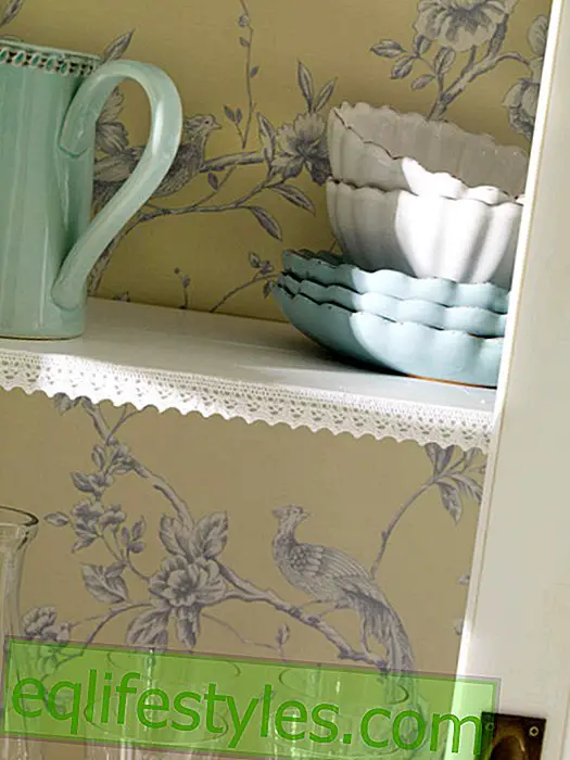


Photo: Manufacturer
Red-green mix
The complementary pair red and green promotes enjoyment and sensuality in the kitchen . We show how to combine them effectively.
Cooking, enjoying, celebrating - in the kitchen all sociable and communicative processes come together. The best color design is from the point of view of color psychologists therefore in reds . They are said to have activating, vitalizing, stimulating, dynamic and even appetizing properties.
More than just a good assistant chef for a harmonious furnishing concept, the complementary color green gives off a balancing, refreshing and regenerating effect. Together they form an unbeatable team: they emphasize each other, become even more expressive, brighter, happier and more intense in interaction.
The dominant duo hardly tolerates any other color design next to them. Cool blue and brilliant white, however, keep his temper at bay and tickle the modern side of red-green.
Color Tips
1) Apple green brings spaces to shine thanks to its high proportion of yellow pigments.
2) Green and water blue: The color of the forest and those of the ocean bring modernity into the home together. The Trend Duo creates an airy-light atmosphere and goes well with light-wood furniture.
3) White and Red: Because red can visually reduce the size of a room and leave a stifling impression, dark nuances in particular need a radiant counterpart. Who could fill this role better than Snow White ?!